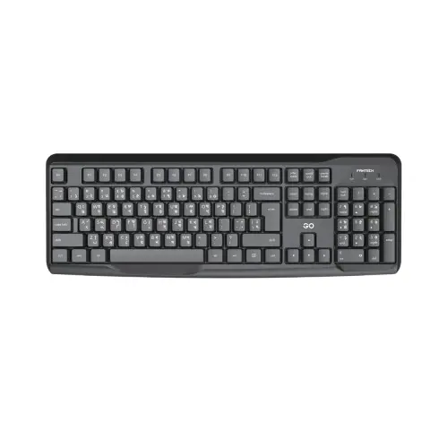
Fantech GO K211 Bangla Keyboard
Original price was: ৳ 800.৳ 550Current price is: ৳ 550.
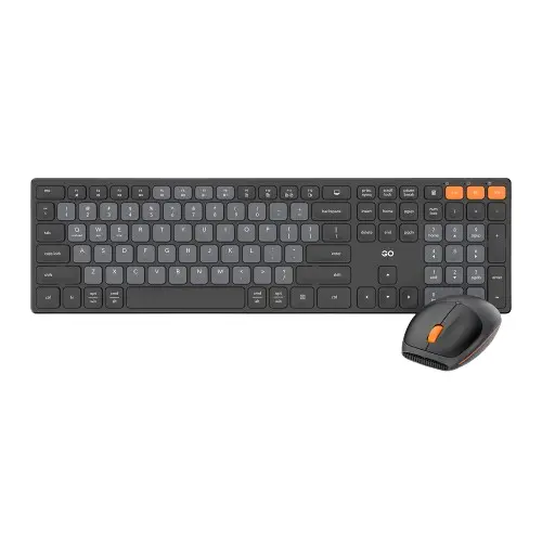
Fantech GO KM103 USB Keyboard and Mouse Combo
Original price was: ৳ 1,400.৳ 1,169Current price is: ৳ 1,169.-15%

Select options
This product has multiple variants. The options may be chosen on the product page
Fantech GO Mochi 101 WK899 Wireless Keyboard Mouse Combo
Original price was: ৳ 3,300.৳ 2,790Current price is: ৳ 2,790.-13%

Select options
This product has multiple variants. The options may be chosen on the product page
Fantech GO Mochi 85 WK898 Wireless Keyboard Mouse Combo
Original price was: ৳ 3,000.৳ 2,600Current price is: ৳ 2,600.-19%
Select options
This product has multiple variants. The options may be chosen on the product page
Fantech Go Pop WK895 Wireless Keyboard and Mouse Combo
Original price was: ৳ 2,800.৳ 2,269Current price is: ৳ 2,269.
FANTECH GO TUNE WH06 WIRELESS HEADPHONE
Original price was: ৳ 2,900.৳ 2,253Current price is: ৳ 2,253.-27%

Select options
This product has multiple variants. The options may be chosen on the product page
Fantech Go Vibe WH05 Wireless Headphone
Original price was: ৳ 2,800.৳ 2,038Current price is: ৳ 2,038.-23%
Select options
This product has multiple variants. The options may be chosen on the product page
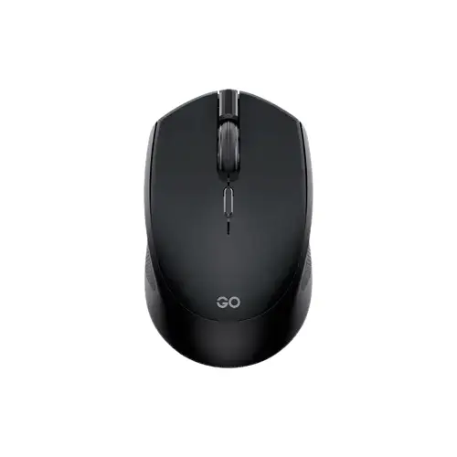
Fantech GO W190D Dual Mode Wireless Mouse
Original price was: ৳ 1,500.৳ 1,150Current price is: ৳ 1,150.-27%
Select options
This product has multiple variants. The options may be chosen on the product page
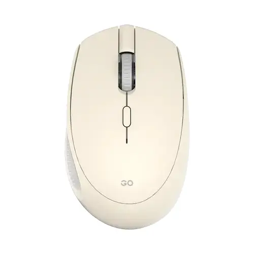
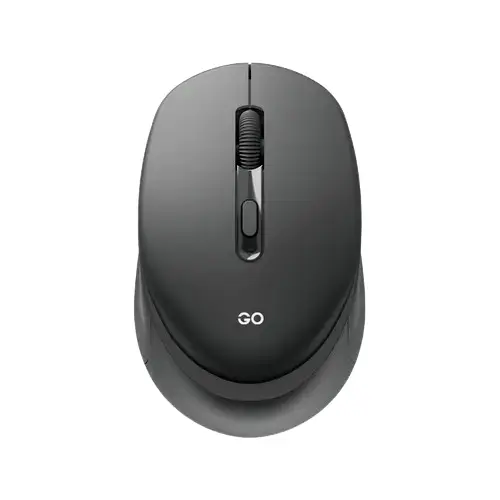
Fantech Go W191 Silent Wireless Mouse
Original price was: ৳ 800.৳ 581Current price is: ৳ 581.
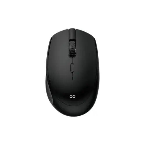
Fantech Go W192 Silent Wireless Mouse
Original price was: ৳ 800.৳ 575Current price is: ৳ 575.-23%
Select options
This product has multiple variants. The options may be chosen on the product page
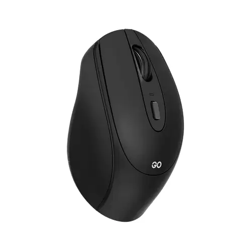
Fantech Go W193 Dual Mode Wireless Mouse
Original price was: ৳ 1,500.৳ 1,150Current price is: ৳ 1,150.-23%
Select options
This product has multiple variants. The options may be chosen on the product page
Fantech GO W193D Dual Mode Wireless Mouse
Original price was: ৳ 1,500.৳ 1,150Current price is: ৳ 1,150.-33%

Select options
This product has multiple variants. The options may be chosen on the product page
-33%

Select options
This product has multiple variants. The options may be chosen on the product page
-33%

Select options
This product has multiple variants. The options may be chosen on the product page
-33%
Select options
This product has multiple variants. The options may be chosen on the product page